Wednesday, 21 March 2012

Evaluation Task 4 - How did you use new media technologies in construction & research, planning & evaluation stages?

Hardware

Above is an image of all of the equiptment we used - A camera, tripod, computer/ laptop. We also used cellotape to secure the camera to a car in part of our teaser so that we could get different camera angles and without the camera shaking.
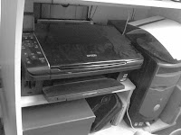


When capturing the animatic, I used a Epson printer which has a high quality scanner so that we could have good quality images of our drawings to use for the animatic, rather than using a camera as it will not focus on the paper properly, therefore meaning a less sharp and lower quality animatic.
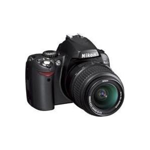

We used a Nikon D40 camera to capture the still image of the demon character in our film, the images of location, actors and film diary images. The reason for using this camera is because of the high quality, rather than using something such as a phone camera. We also used this to capture our images for our film poster and magazine, so again they are high quality images.

Software

YouTube was used frequently throughout our research, planning and final film stages.
In our research and planning, YouTube was used to research and display film trailers on my blog by embedding them and different institution logo footage. It was also used to display our animatic and then our final film. It is affective dislpaying these on Youtube as videos there are easily acessable and can be viewed in high quality, also to fill a whole screen. By having it with a higher quality to our film it will ensure it is enjoyed more.


Blogger is the most used software in this whole process, as it is used to store all of the research and planning and then to display our final film all in one place. Tools of Blogger which are essential are the fact images can be included, but also that videos from YouTube can be embedded to be displayed there.


We have used Adobe Premiere for editing our final film, but it has also been used for creating our animatic so that we could add transistions we would like to use for the images and then upload it as the correct file type to YouTube. For our final film we used many editing transistions which are avaliable with Premiere such as dip to white, dip to black and the avaliability of the text tool.


Adobe Photoshop has been used for editing the still image of the demon character which is used in our final film. Also Photoshop has been used for making our magazine and poster. There are many tools which are helpful for high quality editing, primarily the dodge and burn tools for completely changing the look of an image.


Adobe Illustrator was used for experimenting creating a magazine cover, though I used Microsoft Publisher instead as I believe it suits creating a magazine better than Illustrator does.


I used Microsoft Publisher combined with Adobe Photoshop to create my magazine and film poster. Microsoft Publisher is useful for adding text and shapes, as it has many different types which are easy to apply on top of an image.

Evaluation Task 3 - What have you learnt from your audience feedback?


Above is our feedback from our class after watching our teaser trailer for Hangman.
From this we have learnt the following:
Conventions of horror teaser trailers used:
  • Short and quick shots
  • Eerie music
  • Weapons - Axe and knife to give an idea what's going to happen
Strengths:
  • Fast paced editing
  • Well edited
  • Non linear - Gives enough information about the plot to make audiences interested, but does not give too much away
Improvement:
  • The music could be changed as it is abrupt


From putting our film on the social networking site Facebook, we have gained many comments which we have placed under particular questions

In what ways does my trailer remind you of other trailers?
> Part of the film with people watching TV reminds me of the little girl watching television in the film Poltergeist (1982)

What do you think are the strengths of my trailer?
> The music, it's very sinister
> Ouija board scene includes very clear and high quality footage - feels like you're there
> Like the change of angle in the scene in the hallway
> Fast paced, always changing shots makes it interesting
> Dropping camera shot at the end
> Opening film titles were effective in helping to set the trailer off, especially with the music
> "The trailer kept my attention and left me intrigued into the story line. It also didn’t give away too much of the plot, as some other trailers do"

What do you think are the weaknessess?
> The scene with the television footage is dark - maybe too dark?
> Some voices from characters, maybe a scream.

Evaluation Task 2 - How effective is the combintation of your main product and ancillary texts?


Above is a audio recording of my group and I discussing our film and why we chose to include certain things etc.


How our texts compliment one another


The three texts (teaser trailer, magazine and poster) all compliment one another.
This is because they all have a common factor - the use of images showing a person with blacked out eyes, giving a demonic look. This shows to the audience what the film is about. In all three of these texts we have not given much away about the films happenings, but different conventions are used to create a scary and interesting feel about this film.
  • For example in our magazine, by calling this film the 'Horror movie of the year' this means it has obviously been given a good review by Empire, so people will want to see it.
  • On our poster, we have used the tagline 'You'll never escape' to show to the audience this film is exciting. Also on the poster the rope texture on the Hangman title does subtly show to the audience what this film is about, though as it is of such low opacity they may not notice it at all, again going with the idea that we do not want to give too much away.
  • In our teaser trailer, no actual hangings are shown so that the audience become intrigued as to firstly why the film is called Hangman, but then because there is so much action in this teaser trailer the question is raised, what exactly will it lead to? 
These texts also compliment one another as they show to our target audience exactly what genre this film is - supernatural horror.
  • Our teaser trailer displays this by displaying a ouija board - something clearly showing that supernatural happenings will occur.
  • Our poster includes a person with demonic eyes, which is supernatural. Also blue tinted font is a colour associated with supernatural film, so this is made clear there also.
  • Our magazine shows our genre through referring to the 'Top 100 must-see supernatural horrors' in another feature, which shows a connection. Also in the same way as our poster, the font shows our genre too.

Evaluation Task 1 - In what ways does your media product use, develop or challenge forms and conventions of real media products?


These nine frames outline differing elements of our final teaser trailer which use, develop and challenge forms and conventions of real media products.

1 [Top Left]: The title of our film. We have chosen 'Hangman' as our film title. By having a one word film title it vaguely gives an idea of what the film could include, but it does not give too much away still giving a feeling of mystery in our teaser. This can be compared to a vague title of a real production such as Below (2002), instead of something like The Haunting In Connecticut which gives away the exact happenings of the film.

2: Setting/ Location. This screen shot of the house clearly sets up our location for our film. By having our film set in a house/ a rural area, it will give a feeling of unease for the audience. By having a horror film inside a house, it will show to the audience characters are not safe where ever they are and because the home is something associated with safety, it will give more of a feeling of fear. By also having this house in a clearly rural area (shown by all of the trees and lack of other people and cars) this shows to the audience if there are any horror film troubles, the characters will not be heard or saved. The idea of having our film set in a rural area can be compared to the film The Cottage (2008) which although it is a comic horror film, it displays how by setting a horror film in a rural area, there is nobody around to help the victimised characters survive. By having a horror film set inside the house this can be compared to many horror films such as The Grudge (2004) and Insidious (2011) in which the setting is inside a house, again showing that the feeling of safety inside a house can be eliminated in horror films.

3: Costumes & Props. For the costume of our victim characters, we decided to dress them in very plain and casual clothing, casual to give the idea they are just at home as normal and plain because we didn't want anything too bold distracting away from the action happening in the film. For our horror character we wanted something casual also to show that this is a real person, but who has come back as a ghost. The use of a dark jacket with a hood conceals the identity of the character, not giving away their gender or age. The use of the hood also shows to the audience that in some point of the film, the hood could be removed and therefore the identity of the character revealed, but obviously this is not revealed in the teaser trailer. This can be compared to the costume in The Haunting In Connecticut where the victim characters wear casual clothing, but also in the trailer for this film a visible ghost is seen very quickly and then dissapears, but they are also in average and casual clothing.
For the props we do not have a main one (e.g. our main horror character does not use a particular weapon), but instead there are random props included in our teaser trailer to increase the fear. For example, in the screen shot we have included here an axe is used outdoors, but also in another shot a knife is included indoors. This will display to the audience that where ever the victims are in the film, they cannot be safe. This can be compared to slasher and gore films such as Friday The 13th, but there are not any supernatural films we could compare our use of props used by ghosts to, as most supernatural beings in films use their supernatural powers on victims rather than house hold props.

4: Camera work & Editing. Throughout our we used different camera angles to try and capture our scenes in creative and interesting ways. We have shown this in this print screen in which we captured a scene reflected in a car wing mirror to display nobody there, then when the victim character closes the door of the car the horror character can be seen in the wing mirror. This adds an element of fear just outside the home, as it shows the horror character can turn up quickly and at any time. This can be compared to the various shot types used in the trailer for Below. Some examples of shot types are close ups of eyes are used to show fear which is something we have used in our teaser and establishing shots of the sea are used to clearly show to the audience where the location of the film is which is also something we have used.

5: Title font & style. We carefully chose our font to suit our genre of film, as we wanted to reflect this through the titles. From looking at other film trailers' titles such as Paranormal Activity and The Haunting In Connecticut we saw how the font type used is always sharp and harsh reflecting the horror genre of our film, as if it was a circular font it would look more friendly and less scary therefore not reflecting our films genre. We also used a white colouring to reflect the supernatural genre of our film, rather than having a red colouring which would reflect of a more gory, slasher horror genre. The colouring of the font we have used can be compared to the colour of The Haunting In Connecticut trailer in which they use a light/ pale blue coloured font to display the supernatural happenings as the colour white and pale blue are typically associated with ghosts and the supernatural.

6: Story & How our teaser sets it up. For this we have chosen a screen shot of the ouija board which clearly displays how our story begins - characters watching a television programme and then creating their own ouija board which creates havoc in the house with supernatural beings. The havoc is shown through many shots showing this e.g. the violent props and the characters always being watched, but this is also affectively shown through our use of editing them together quickly which gives the fast paced and exiteable feeling to it, showing the film will be full of action and create a lot of fear. This can be compared to the trailer for The Devil Inside where the storyline is set up through footage of police tapes and also the fact that the main woman is going looking for her mother, shown through the dialogue which sets up the storyline straight away.

7 [Bottom left]: Genre & How our teaser suggests this. For the screen shot to show genre we chose the still of the supernatural beings face. This still photograph is used very quickly in between shots of the ouija board. The photograph is used so quickly that it isn't exactly clear as to what it is, but it can be seen that it is a person. This shot clearly displays the genre of supernatural horror, as the person is seen with pale skin and blacked out eyes, something which is not natural. This can be compared to the look of The Grudge's main characters, in which they have pale skin and the little boy character has blacked out eyes, showing something to be feared of and which isn't natural.

8: How characters are introduced. Our characters are not properly introduced as our final product is a teaser trailer, meaning we will focus on the action. The victim characters are breifly introduced watching television, showing their interest at first in the supernatural. They are again all shown attempting to escape from the supernatural being inside the house. The screen shot we have included is a close up of one of the victims eyes, displaying their fear of the supernatural being. Our horror charater is introduced firstly through the fast cut still photographs of the supernatural being, but then in the film footage they are included frequently with different props and in different places following the victims. This can be compared to the Paranormal Activity 2 where there is a shot of the door with nothing there for a very long time which builds the tension, and then the horror character is there suddenly. This goes along with the idea that we have used in which the horror character can be in the house at any time. Also in this teaser trailer the victim characters are not introduced, but in the trailer for Paranormal Activity 3 the characters are introduced, this shows the difference between the need for introduction of characters in a teaser and trailer.

9: Special effects. One special effect used is a dip to white editing transistion which fades scenes together. By having a dip to white instead of dip to black, it shows a change in the angle or timing of one scene, instead of a complete change of scene. For example in this print screen using a fade to white between shots of a victim character in the car then uses this transistion to go to a shot showing the wing mirror of the car with the supernatural being in it. If using dip to black instead this would give a feeling to the audience this is the end of the scene, dip to white does not.This can be compared to the dip to white transistion used in the trailer of Below in which this is used at the beginning to made the boat flash. In this trailer it is meant to represent lightening in the film, but our purpose differs from that.

FILM POSTER: Final poster analysis

FILM POSTER: Final poster


FILM POSTER: Experiments/ Progression

For the above experiment the font Blue Highway D Type for the title 'Hangman'. This font was chosen for the title because it is very plain, sharp and therefore shows our genre of horror.
For the blue, smaller titles the font Bodoni MT was chosen. As this is only an experiment, it
became clear that using this wouldn't be affective because the '2013' date it too rounded, therefore making the film look too friendly. Though the blue colouring does give the supernatural genre away to the audience and the main title works well in making an audience notice and remember the films name, we will not be using this as overall it does not look authentic. This is because it does not include features such as credits and institution logos. Though not all film posters use these ideas, this does not work well.

This poster is similar to the above in using the same image and the same font for the Hangman title in the same place. Blue Highway D Type was also used for the credits which are placed on this poster. The opacity for the titles was changed to around 50% as in other film posters the credits are made to be not very obvious so that the focus is not on them. Though the 'Coming Soon 2013' title is in the same size and font as the credits, the opacity is kept at 100% so that the date stands out to the audience. Also a Paramount logo is included, as this is our chosen institution. Photoshop was used to edit this from black to white, as white fits in with the blue font better, as black would be too distracting away from other elements.

This poster is the same as the above, but instead a low opacity image of rope is added to the hangman title. This ensures the title looks more interesting, but also it subtly gives away the plot line.

FILM POSTER: Fonts


Fonts that we are considering for using for our film poster is the two displayed above. This is because, similarly to our Empire magazine cover it's clear that by showing the genre of our film a sharp and pointed text must be used, rather than something more rounded as it shows it could be of a more friendly genre e.g. romantic comedy.

FILM POSTER: Colour scheme

From my research it has become clear that using a blue colour scheme will be affective in displaying our supernatural genre of film.
A good example of this is the Paranormal Activity poster, in which the whole main image has a blue colour cast, which clearly shows the genre of film - supernatural horror.

Below are a few more examples which display a blue colour scheme, showing this can work well for displaying the films genre:


Though, for our film poster we will not use red font as this gives off more of a gore horror film feel when we want to focus on the fact our film is of the supernatural genre which will clearly be shown by blue colourings. This is a technique which we have also used in our Empire magazine cover.

FILM POSTER: Taglines

Examples of poster taglines from the horror posters I have researched:
  • "The past never dies. It kills" The Return
  • "Fear moves in" The Uninvited
  • "What will it sound like when you die?" One Missed Call
  • "If bad people hurt someone you love, how far would you go to hurt them back?" The Last House On The Left
  • "Fear what happens next" Pandorum
  • "Dare you experience the U.S phenomenon?" Paranormal Activity
  • "Welcome to your new nightmare" Nightmare On Elm Street
  • "Innocense dies. Abby doesn't" Let Me In
These taglines above have inspired our ideas:
  • You'll never escape
  • They'll never leave
We have not decided yet if we will use a tagline, as not all posters do, especially if they are more of a teaser poster.

    FILM POSTER: Possible images to use


    These two images differ as one is of a building, which would display our location and the other is of a demonic character. Though unsure at the moment, so we will experiment, it is more likely we will use the demon character image as it is more exiciting for the audience to see the cause for the supernatural events in our film rather than just seeing the house.
    The house image is not of the actual house we filmed in also, but it could gives ideas to the audience about if the main characters are lead somewhere as it differs from the location setting shown in the teaser trailer. The image is changed to black and white, also the edges are darkened so that the building of the image is the focus rather than anything else.
    The demon character is edited so that the eyes are black using the brush tool on Photoshop, giving a supernatural feel to show the genre. The hue of the image is lowered so the pinks of the skin are not visible, therefore making it look more dull and again supernatural. Also the images edges are darkened using the burn tool so that the focus is on the eyes and
     pale skin.

    FILM POSTER: First experiments

    Above is a first trial of a film poster. This poster could be compared to 'The Last House On The Left' poster, as it uses some of the same conventions - Black and white image with red text. I took this photograph myself of a building which looked run down and creepy, which gives a feeling to the audience that this house has something wrong with it (so the horror aspect of the film will be clear)
    From this it's clear it would be better to use a blue coloured font, as the red gives off a feeling of a gore horror film rather than supernatural.

    FILM POSTER: Conventions to consider

    From researching many film posters of the horror genre, I have seen how different conventions need to be considered before producing my own. Conventions I will have to consider are:
    • The use of credits - If they are nessecary
    • Tagline
    • Release date being in different colouring to the rest of the image and font
    • Title being large and different colour from other font
    • Colour scheme to suit my films genre
    • Including director in large font
    • Including main actor in large font
    • If there will be a lot of information included, or if it will be more of a teaser poster - similar to the Let Me In poster which does not have much information.

    FILM POSTER: Poster Research


    • Blue and white tones give a supernatural feel
    • Hand in the eye raises questions about the happenings in the film - Makes a creepy looking subject
    • Textures over the top could represent destruction in the film - perhaps to the victims
    • Dark text against the white stands out
    • Name of the main star (Sarah Michelle Gellar) put along the top of the film title
    • Tagline 'The past never died. It kills'
    • Credits are included underneath - may appeal to audiences as they may see another actor/ producer/ director that they like


    • Title of film is clear against the clean white background
    • Clean white background ensures focus on the text and the image
    • Hand coming out of the eye gives an intrusive feeling to this film
    • Colouring of the image is reduced, a sepia tone is given to it so that the focus again is on the subject of the image rather than any colouring.
    • Name of the main star 'Jessica Alba' is written across the top of the film title
    • No tagline

    • Tagline 'Fear moves in' gives an intrusive feeling
    • The tagline compliments the image, giving an intrusive and unsafe feeling in the home.
    • Image includes a faceless/ silohuetted person - gives a mysterious and worrying feel, as well as the fact that they are looking into the house.
    • Writing displayed at the top "From the producers of 'The Ring' and 'Disturbia'" shows to horror audiences this is produced by people who have had sucessful films before, meaning it should be good
    • Black and white theme with a hint of pale blues in the image of the window gives a supernatural horror feel
    • Credits included

    • Manipulation used on the face, so the eyes are replaced with mouths. These mouths could be screaming, showing the fear that will be created. As this is a strange image it also gives a grotesque feel to the film.
    • The image clearly shows the films title 'One Missed Call' as it includes a phone, showing to the audience exactly what this is about.
    • Bright white text against the black background means it stands out
    • Credits included
    • Tagline 'What will it sound like when you die?' gives even more of an insight to the film - that there will be killings and a phone is definitely related.
    • Tagline is in red, which shows that there will be killings. Raises question if this could be classified into the Slasher horror genre.
    • 'January 4' stands out as it's in red, against all of the white credits.

    • Red font with blood included clearly show a happening in this film - killings
    • A house is highlighted and fog is included shows the location of the film and gives a scary feeling to this film
    • Black and white image ensures the focus on the text
    • 'In Cinemas June 12' is in red and a larger font which stands out so audiences know when this will be avaliable

    • Blood stains show the genre of the film/ events in the film
    • Lighting highlights a character in a dramatic position showing that there is a bad happening in the film. The lighting also highlights the text
    • Use of metalic and bold text displays to the audience this film is of an action or horror genre, not something like romantic comedy
    • Tagline 'Fear what happens next' is highlighted at the top of the image makes the viewer interested as to know what will happen in this film.

    • Image across the middle of the camera tinted blue. Stands out from everything else, but also the blue shows the fact this is a supernatural horror film
    • Grainy affect of the image displays the fact this film is recorded using a home video camera
    • Quotations at the top of the poster make the viewers more interested
    • Red font gives a feeling of danger and the horror genre
    • 'In Cinemas November 25' is in white whereas the rest of the font is red. This stands out and clearly shows to the audience when the film is out.
    • No credits
    • Tagline 'Don't go alone' gives a feeling to the audience they will be scared in the cinema

    • Red/ Brown colouring of image clearly shows genre - horror
    • All other font (Credits) is small other than the title and the release date, which are also in red so that they stand out
    • The face of the person in the image is not clear, though cuts on the skin and a blade are highlighted which add an element of fear

    • Angelic image of a blonde haired girl in white is juxtaposed against blood stains, showing an element of horror - suggests something may happen to the innocent
    • Title and date of release are in red, rest of the font (Credits) is not. This means the important parts stand out

    • Similarly to the above, the image is covered in ice which gives an unfriendly feeling to this film showing the genre of the film.
    • The blood stains added to the 'ME' font stands out clearly against the ice
    • This poster contains less information, only that of the director, so this may have been produced earlier on when the release date was not decided/ the film was not finished.

    • Blue colouring gives a mood to this poster, complimenting the clouds and showing this film will not be positive
    • The dark edges mean the focus is on the tagline "What are you capable of?" and the figures of three humans
    • The three people in the sky gives a supernatural feel, as this is impossible
    • White, straight text adds to mood of negativity and stands out against the background
    • A facebook, scan and twitter symbol is shown to make it more of an interactive film to the audience, as they can gain information in other ways
    • 'In cinemas Feb 1' clearly shows to the audience when the film is released

    • Grey and blues display the genre - supernatural horror
    • The face which is subtly visible in the background shows the genre once again, along with the tagline "Do you believe in ghosts?"
    • The main actors name is included, which is the unique selling point of the film, making the audience more likely to watch this
    • The white, straight font used is blurred in with the smoke to give a ghostly affect
    • 'Cinemas Feb 2012' shows the release date clearly
    • The website is included showing to the audience they can gain information there
    • Institution logos are included next to smaller fonts

    FILM MAGAZINE: Empire Cover Analysis

    FILM MAGAZINE: Final Empire Cover


    We have changed our film magazines image, as we saw how the other one was uninteresting. Also we had to change the design around this, so instead of having an image banner we have used just text and the '+' convention of Empire magazine to include other features.

    FILM MAGAZINE: Change of final idea

    After producing and analysing what was thought to be the final film poster, this has changed because of the fact this does not look like an authentic Empire cover. Points which showed us we needed to change our idea was that the image was uninteresting to look at, the banner of images was slightly distracting and some of the font wasn't authentic and professional looking, therefore we have changed our design.
    We are keeping most of the conventions the same (colouring, etc.) but instead changing the image to something more interesting and removing the banner idea, instead using the technique Empire use when they show a '+' and then other features with no images. For example in the Batman and Joker covers I have previously analysed.

    FILM MAGAZINE: Final cover analysed

    FILM MAGAZINE: Final Empire magazine cover


    Above is my final Empire magazine cover for our film 'Hangman'. The aspects I have changed from when I was experimenting with this cover is blending in the dark to the image at the top of the magazine cover better, so the line isn't so distracting and harsh. Also darkening the eye and surrounding with the burn tool on Photoshop, then lightening the skin with the dodge tool which adds to the ghostly/ supernatural feel I want to portray in this magazine cover, as it is the genre of our film.

    FILM MAGAZINE: Experiments/ Progression

    Above is an unfinished version of an experiment for a magazine cover for our film, Hangman. This displays features such as the Empire title, including the website, the price and release date for magazine, main article 'Hangman', tagline for main article 'Horror movie of the year' and 'Exclusive pictures on set', a line of images displaying features inside the magazines [new films to be released], a barcode, features relating to the main article 'Top 100 must see supernatural horror films!' and also the beginning of other features at the bottom 'Horror overload' which is a feature taken from another Empire magazine using the Magic Wand tool in Photoshop.

    This is the finished version of the above unfinished magazine cover. I have made some minor changes which have made a difference.
    One change is the bottom section of the magazine which includes some other features to be included in the magazine. Instead of using text I took from another Empire magazine, which is what I began doing with the 'Horror Overload' text, I instead began using my own text. This is because there was not any other text I could find which would be relevant to use on my magazine cover, for example something relating to horror or a recent film. Instead I have used the font Blue Highway D Type, which is similar to the type of font used for Empire's small text. I used this to differ from Impact, as from my research it's obvious Empire use some differing fonts. I also used differing colours (not just white, instead white and pale blue) to ensure the names of features are obviously seperate and stand out. Also the blue colour I have used is the same as the colouring I used for the other text.

    FILM MAGAZINE: Font


    The main font we have chosen to use for our magazine front cover (for the text other than the Empire title) is Impact. This font is affective for the front of a magazine as similarly to the font used on the front of Empire magazine it is very plain and therefore not distracting away from the information.


    Examples of distracting texts are shown above. Curlz MT displays too much detail for the reader to be able to focus on the writing. Bradley Hand ITC is a font which is too weak, not bold enough for the viewer to be able to focus on it.

    FILM MAGAZINE: Possible images to use

    The image above was taken using a slow shutter speed so that moving red light could be included. I then edited this using the Photoshop filter 'Fresco' which made all of the blacks a lot more bold, giving more of a creepy look to the image.
    We will not be using this as it's obvious that this image is of a female, so it is not as scary as if it was unclear what gender the model was, because we want to give a mysterious look.

    This image was created in the same way, also using the clone stamp to rid of the white in the bottom corners of the image. This was used to rid of distracting factors in the image so the focus is on the face.
    This is the image we will be using for our final magazine, as it is similar to the above because it's created in the same way, but it's not as clear this is a female so it is more mysterious. I will black out the eyes simply using the brush tool on Photoshop to make a demonic image for our Empire magazine.